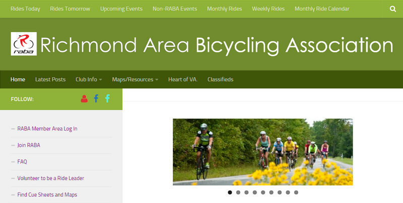
RABA.ORG has changed. The current content and features have been reworked into a WordPress site that uses a responsive theme. That means that the layout of the site will adjust depending on the width of the screen of the device that you’re viewing it on.
Below are screen captures of the main navigation features and how they appear on the 3 categories of screen widths. You can try it out on the various devices you have. You can see all the options on your desktop display by just dragging the sides of your browser window.
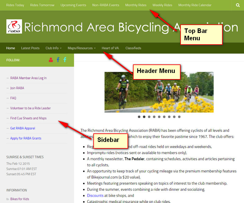
On a Desktop display you’ll see two rows of Menus at the top and a Sidebar to the left.
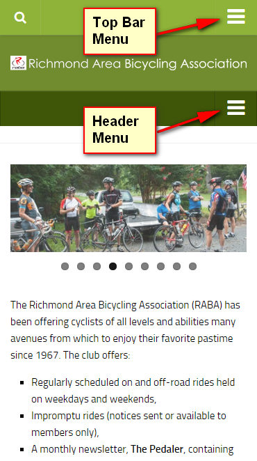
On the narrowest screens the Menus collapse to icons and the Sidebar content is pushed to the bottom of the page.
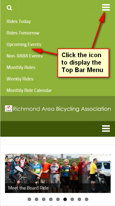
Pressing the icon for the top bar Menu displays its content.
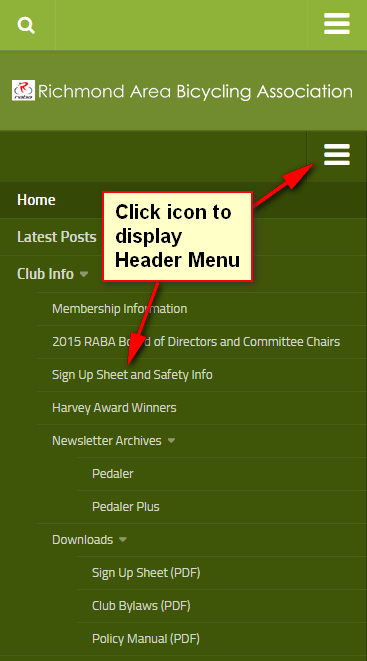
It’s the same with the Header Bar Menu. Click the icon and display the Menu’s contents.
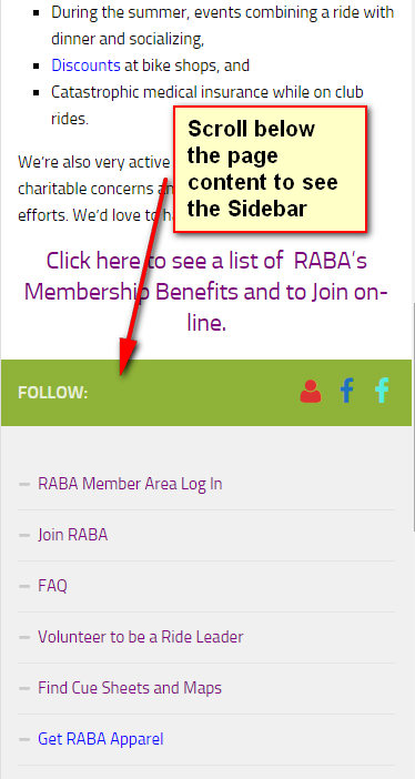
Scroll to the bottom of the page to see the items on the Sidebar.
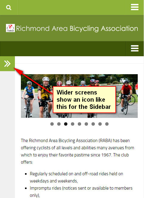
On medium width screens (between 800 and 720 pixels wide) the menus are displayed with icons as for the smallest screens but the Sidebar is shown with an double caret icon.
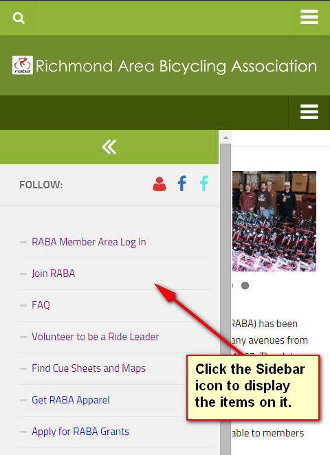
Click that icon to display the contents of the Sidebar.

